

IELTS Line Graph Essay: Smartphone Usage by Age Group (2010–2020)
The line graph below illustrates the percentage of smartphone users across three age groups (18–25, 26–35, and 36–50) from 2010 to 2020. Summarize the information by selecting and reporting the main features and making comparisons where relevant.
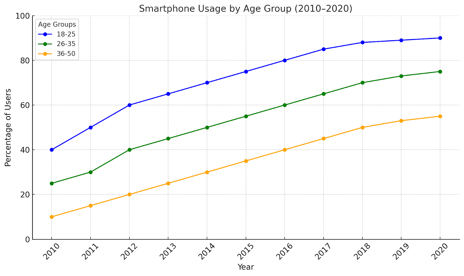
The line graph demonstrates the proportion of smartphone users in three age groups—18–25, 26–35, and 36–50—over a ten-year period from 2010 to 2020.
Overall, smartphone usage increased significantly across all age groups, with the 18–25 age group consistently having the highest percentage of users. In contrast, the 36–50 age group had the lowest usage throughout the period, though it also showed notable growth.
In 2010, the 18–25 age group had the highest smartphone usage at 40%, compared to 25% for the 26–35 age group and a mere 10% for the 36–50 group. By 2015, smartphone adoption surged among all groups, with the 18–25 age group reaching 70%, followed by 50% and 30% for the 26–35 and 36–50 age groups, respectively.
By the end of the period in 2020, the 18–25 group peaked at 90%, while the 26–35 group reached 75%. Although the 36–50 age group lagged behind, it still saw a significant increase to 55%, more than five times its initial percentage.
In summary, the line graph highlights a steady upward trend in smartphone usage across all age groups from 2010 to 2020, with younger people consistently leading in adoption.


0 Comments